I am now a part of the amazing and crazy planner community. Yes it is a thing. For the past few months I have browsing Etsy and looking at all the amazing stickers you can buy for a planner but I didn't have a planner I was happy with. Something that was perfect for life, blogging and university. Until I came across Personal-Planner. And the next thing I know I made a purchase, created my own planner and constantly updated twitter about it coming to me (follow me @pariejoshi). I thought of giving you a little tour...
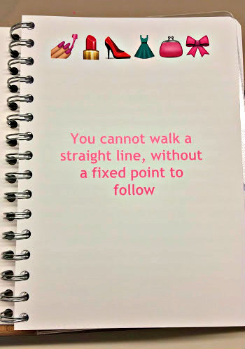
Personal-Planner let you personalise everything and anything so that the planner that you will be using is perfect for you. It starts with choosing the size, I went with A5 but there are other sizes as well, and I think they have a A4 coming too. Then you get to design you front cover, there are lots of patterns and designs you can pick from but I went with my own a lovely quote in gold and polka dot. The other cool thing is the Owner Cover page you get to create, this can include all your personal details but I went with a another quote and my favourite girly emojis.
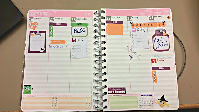
Now, on to the actual planner. another one of the amazing personalisation features of this planner is the colour scheme preference. The gilr inside of me went with pink of course, a little worried after I had picked it but no regrets now I love it! The muted grey is the other colour I picked and it works really well together. You can go as far as picking the design you want on the top of the apge, mine are cute little flowers but options include birds and stripes. Each month starts off with a monthly view, allowing you to put in the most important dates. You also choose the month you want to start with, I went with October and it will finish next October.Then we have the weekly view,there are also options on how you want your week to look like. I went with Vertical Ruled (top and bottom) to kind of resemble other planners I have seen. But if this isn't how you work then horizontal views are also available. You can see the muted grey colour here better than before and see that it works together. The main reason I went vertical is so that I can use lots of cute stickers! This week is Halloween themed, not very full or busy like others but cute! This was a printable from VintageGlamStudio, who I found of instagram and helped me with this whole planner thing. Stickers sound childish, but they make the planning process more exciting and fun!
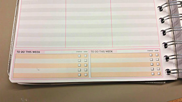
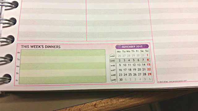
After picking your layout you can choose the items you want on there, you can add personal dates such as birthdays ect so you never forget and also little add ons. I went with To-Do boxes on the left page and a weekly meal planner on the other to help me budget for the week. The other options available are workout schedules and weather. Adding a ruler to come with your planner is another option.
 To make each month easier to find it is colour coded on the edge, and an overview of the next two years can be added to the back of the planner which can help you plan for the year ahead if you have important things to remember. On the back few pages you can choose from lined, square and the newly added colouring pages. I went with lined so that if I need to write something down then then is the best place.
That concludes the planner tour! I have ordered a load of stickers (way more than my bank account can cope with) and will be putting them in a haul very soon. I want to theme everything so November is going to have a colour and then December is going to be all festive! Everything I order will also be from UK sellers so you know what to order and where from. Do you like these types of posts? Planning Addicts Unite!
You can buy your own Personal Planner over on their Site!


No comments
Post a Comment